

Red is a hot primary colour. It is a colour associated with excitement and drama. Like popping on a favourite red dress, it is attention-seeking and,as such, a little goes a long way. It has many cultural associations, in China it is a favoured colour, it’s the colour of Christmas, red for communism, red for danger, red carpets on ceremonial occasions,and it’s associated with passion – think red roses on Valentine’s Day! So it’s going to make a bold statement in your garden.

Red tulip heart
Red in spring:
In the spring border, in the early season light, Red appears more subdued, yet brings a welcome brightness to the scene. I am a tulip fanatic so can happily have them in every colour but some favourite Reds are : ‘Rococo’, ‘Couleur Cardinal’, ‘Ballerina’, ‘Oscar’ and many more besides.
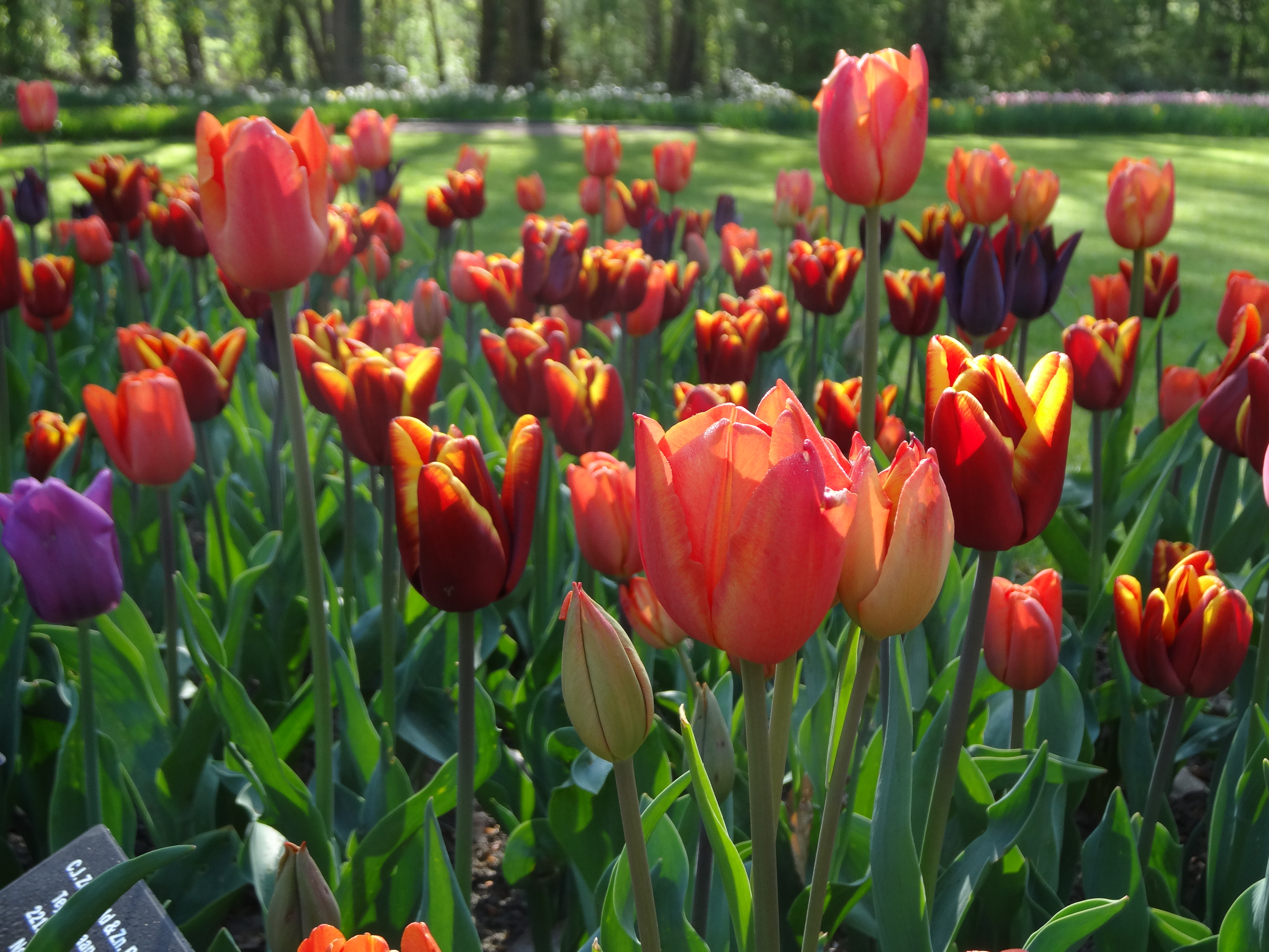
With the grey skies of winter behind us, we are ready for some vibrancy in our pots and borders and the lower light levels are more favourable to the use of Red.
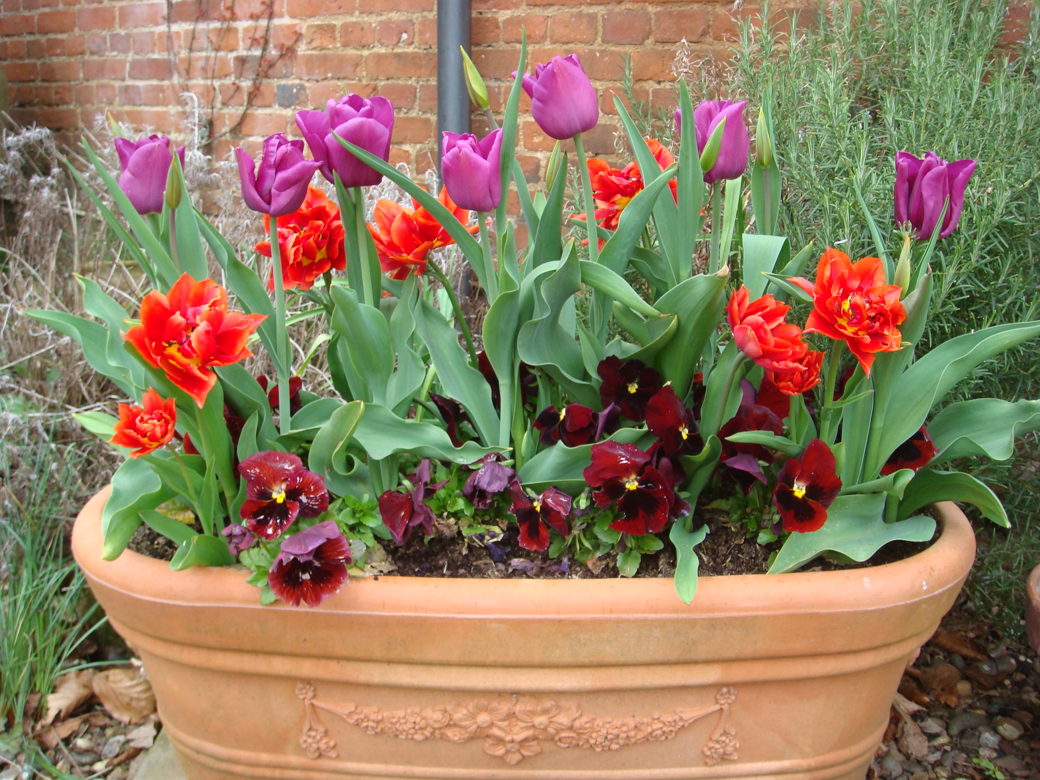
Colour schemes that might appear more garish in the height of summer, are now welcome… maybe because of their transience.

Red in summer :
By the time Red is seen in the summer borders, it can appear much more striking in the harsher light, so use it sparingly as an accent…

… picking up the colour in other accents in your garden.

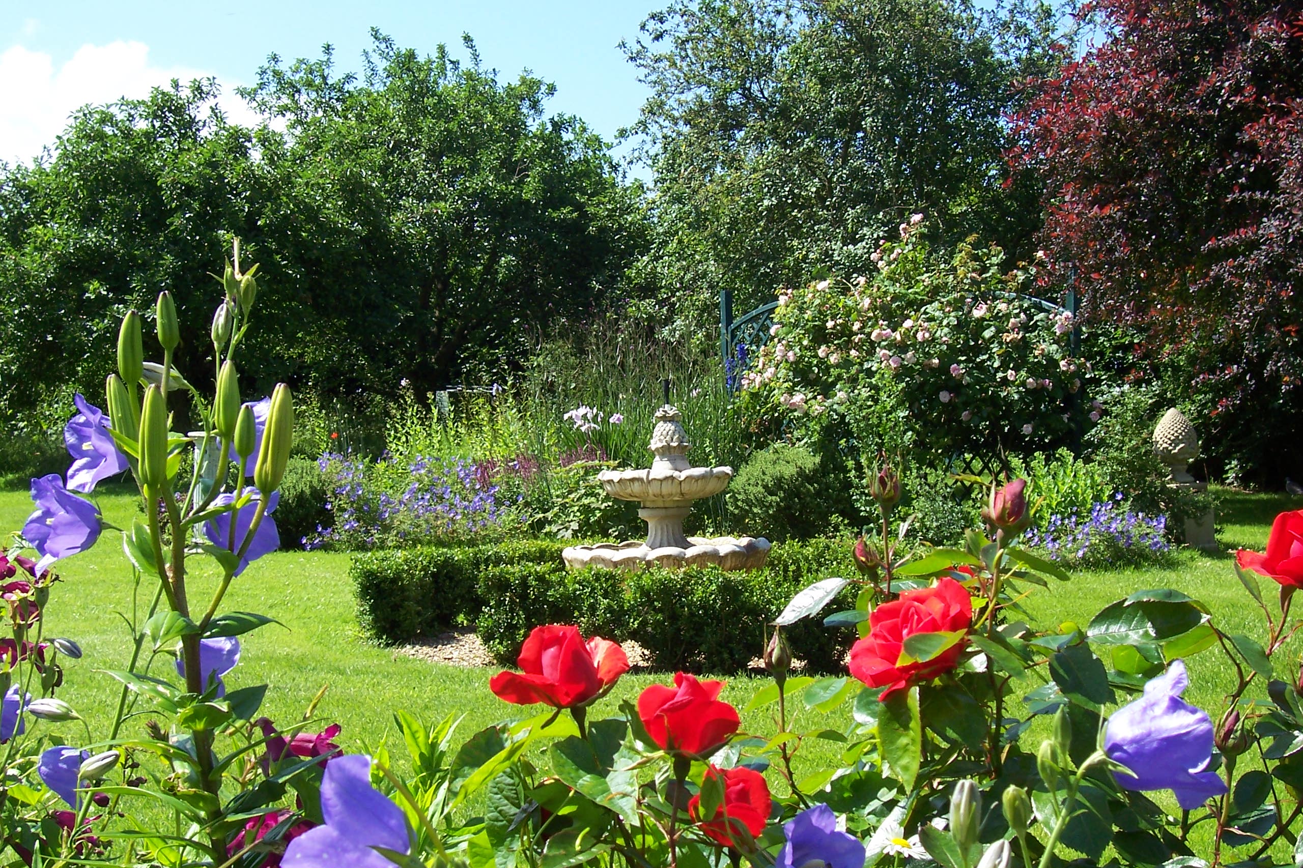
It can certainly liven up a dull planting scheme. At Great Dixter, Christopher Lloyd was fearless in his use of colour, mixing mauve and yellow, orange and red in dramatic colour schemes. For this to work, you have to do it with conviction and it helps if you have large borders to play with, otherwise you’ll end up with the “dolly mixture” effect, a bit of this and that.
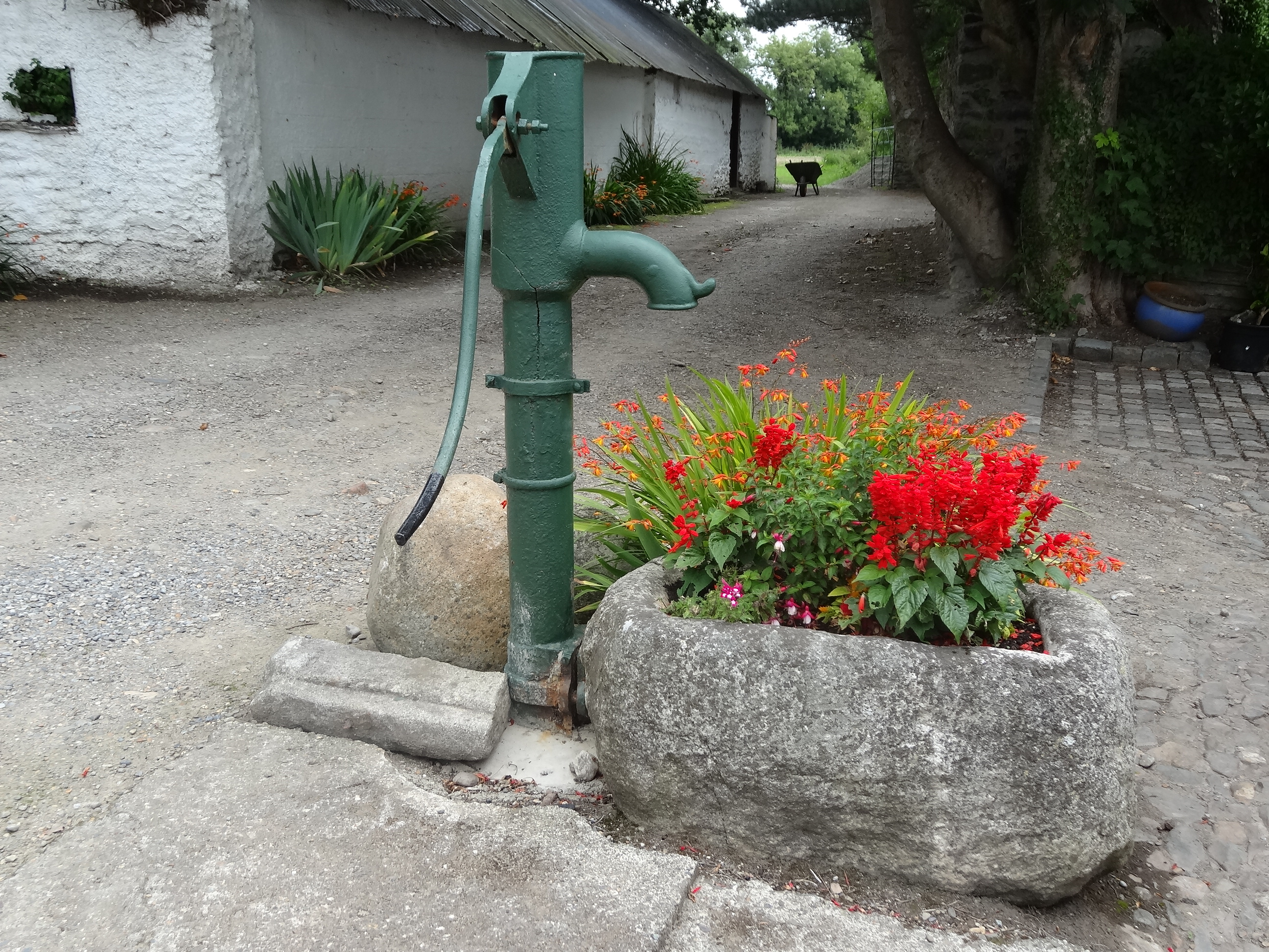
Monochromatic schemes : Red can look very smart in a monochromatic scheme, all on its own. In fact this (below) is not strictly a monochromatic scheme as Red is teamed perfectly with its complementary colour, the green of the foliage.
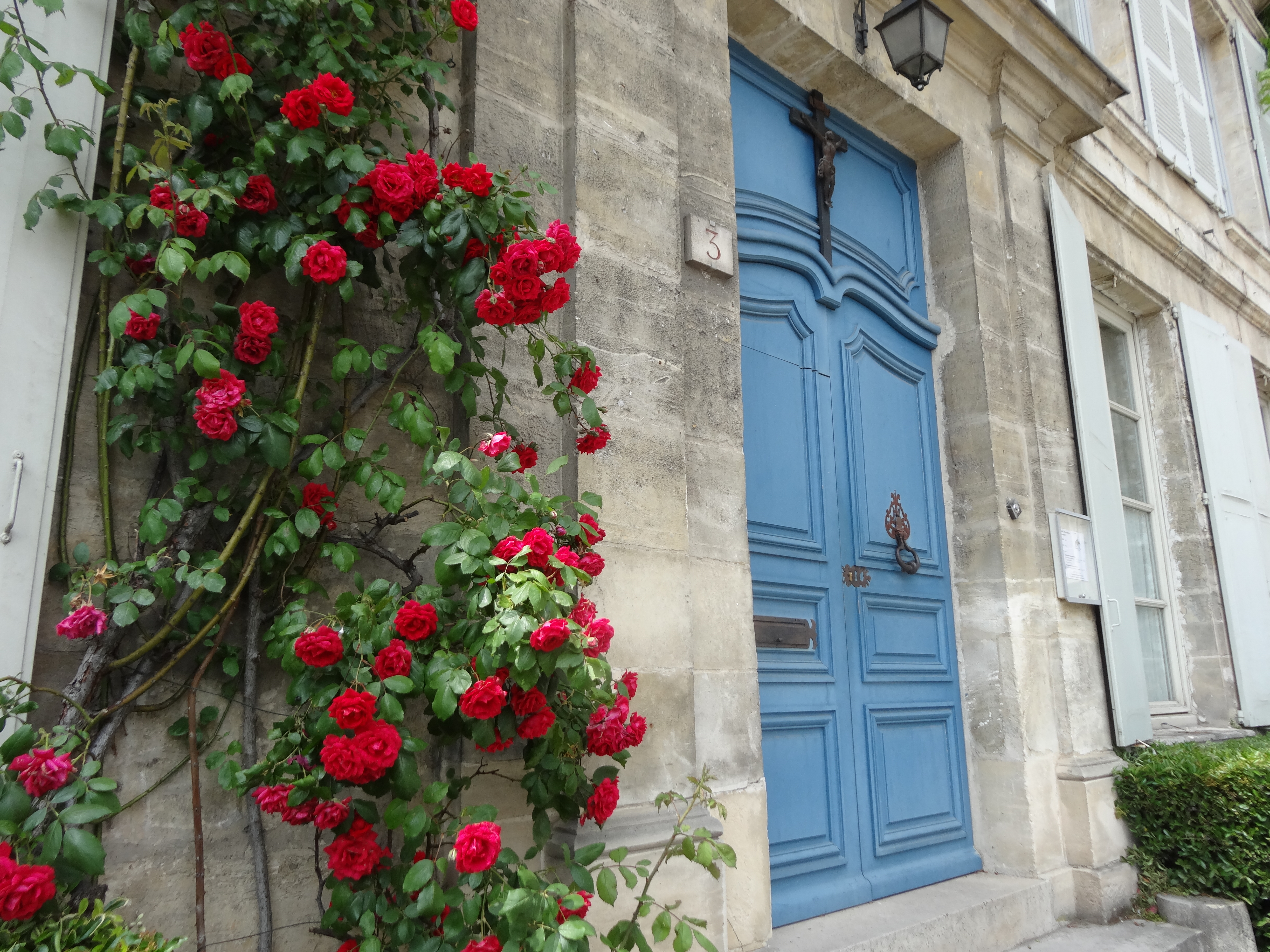
Complementary colours, on the traditional colour wheel, are those which are opposite to each other – red/green, yellow/purple, blue/orange. Complementary colours create the strongest contrasts and reinforce each other – that’s why Red stands out in any border against the predominantly green foliage.
Like the other hot primary colour ,yellow, Red can draw attention to a feature.
Bright red geraniums are often a feature of Mediterranean summer planting , so Red can conjure up images of holidays and sunshine.


Red with other colours:
Red can look crisp and smart when teamed with white and creamy whites, or more mellow when teamed with grey foliage

Red commands attention when mixed with the other hot primary, yellow, but don’t expect a restful outlook when you combine the two.


Dark red can convey a different mood altogether – more subtle and sultry.

and blends in better with surrounding planting.

Cirsium rivulare
Red in autumn :
Later in the year, in weaker autumn light, Red has more depth and balance, as seen here in an almost monochromatic late summer scheme.
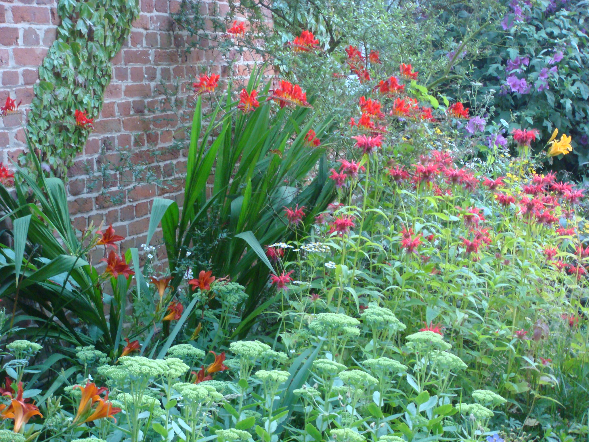
Red autumn nectar-rich border with Crocosmia ‘Lucifer’, Sedum, Monarda, Hemeracallis
Tones of red , maroons and russets, are the colours associated with Autumn, so think about including some red-toned foliage in your colour schemes.

In fact, I think red comes into its own in the softer mellow light of the autumn and so I prefer to use it at this time of year most of all, toning with grasses, dark foliage and other tawny colours of the season.


Dahlia ‘Ellen Houston’

The vivid reds of autumn leaves are produced by natural pigments, Anthocyanins, which develop in the sap in late summer and which also produce the red of apples, plums, strawberries and cranberries.


Red Cranberries used as a feature in a Show Garden,
Bloom in the Park 2013
So Red …
- Can add excitement to a border
- Contrasts well against green foliage, its complementary colour.
- Appears more subtle in the weaker light of spring and autumn
- Can draw attention to a feature
- Can add drama when planted with yellow
- Looks smart in a monochromatic scheme
- Is the predominant colour of autumn
So if you like a little excitement on your plot, add a little Red!
(All photography mine; feel free to use any of Jardin’s images but PLEASE credit and link back)

Thanks for such a vibrantly coloured blog. What a joy to see so many tulips. You have given me ideas for some adventurously red Summer planting!
LikeLike
That’s great! Glad you were inspired!
LikeLike
So many wonderful thoughts on red. My favorite color. Will spend the rest of this icy winter planning for more red in my garden. Thanks.
LikeLike
Thank you – a pleasure! Something to lift those winter spirits.
LikeLike
Really loved this post – thank you! Red is such a striking colour – and I think you’re right that in many cases its effects can be best discovered with restraint.
LikeLike
Thank you Padraic. Yes, restraint is a good word to use when it comes to vibrant colours like red.
LikeLike
I love using dark red, but find scarlet more difficult to place so much so my runner beans have white flowers. Is the top photo in Belgium or is it Keukenhof in Holland?
LikeLike
I agree – I love dark reds.
Love the comment re runner beans.
The top photo was taken last year at Groot-Bijgaarden in Belgium. Lots of tulips and none of the crowds.
LikeLike
Great blog–I think I will go and paint the town red tonight!
LikeLike
Ha, thanks Christopher. Hope you won’t “be in the red” after your night out!
LikeLike
So bold and vibrant, stunning images! More snow here today leaving my immediate visual world covered in white, it’s lovely but I do miss colors, so thanks for this. 😀 I absolutely adore the red tulip heart! ♥
LikeLike
Thank you. Snow sounds nice, we’ve had unremitting rain, wind and grey skies for days so I had to add a little colour with this very red post!
LikeLike
Gorgeous pics. I adore splashes of red and pink in my garden. 🙂
LikeLike
Thank you! Glad you enjoyed them.
Is your garden in Durban? I spent 10 years in South Africa and miss it so much.
LikeLike
Pingback: Going green in the garden | Jardin
Pingback: Embracing Autumn. | Jardin
Pingback: Colour in my Garden. | Jardin